 |
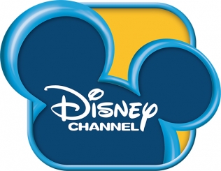
| New logo. Both images from adweek.com article. |
Originally, the logo was inside the box and featured the classic Mickey Mouse look.
 |
| Old logo. |
What do you think of the change? I don’t really see the need for it, and I always thought the Mickey Mouse ears were cute.
But hey, at least it’s not as scary as McDonald’s new mascot….
See you all real soon.

salt likit
ReplyDeletesalt likit
dr mood likit
big boss likit
dl likit
dark likit
MFZVPR
This is very helpful, thank you!
ReplyDeleteتسليك مجاري بالاحساء